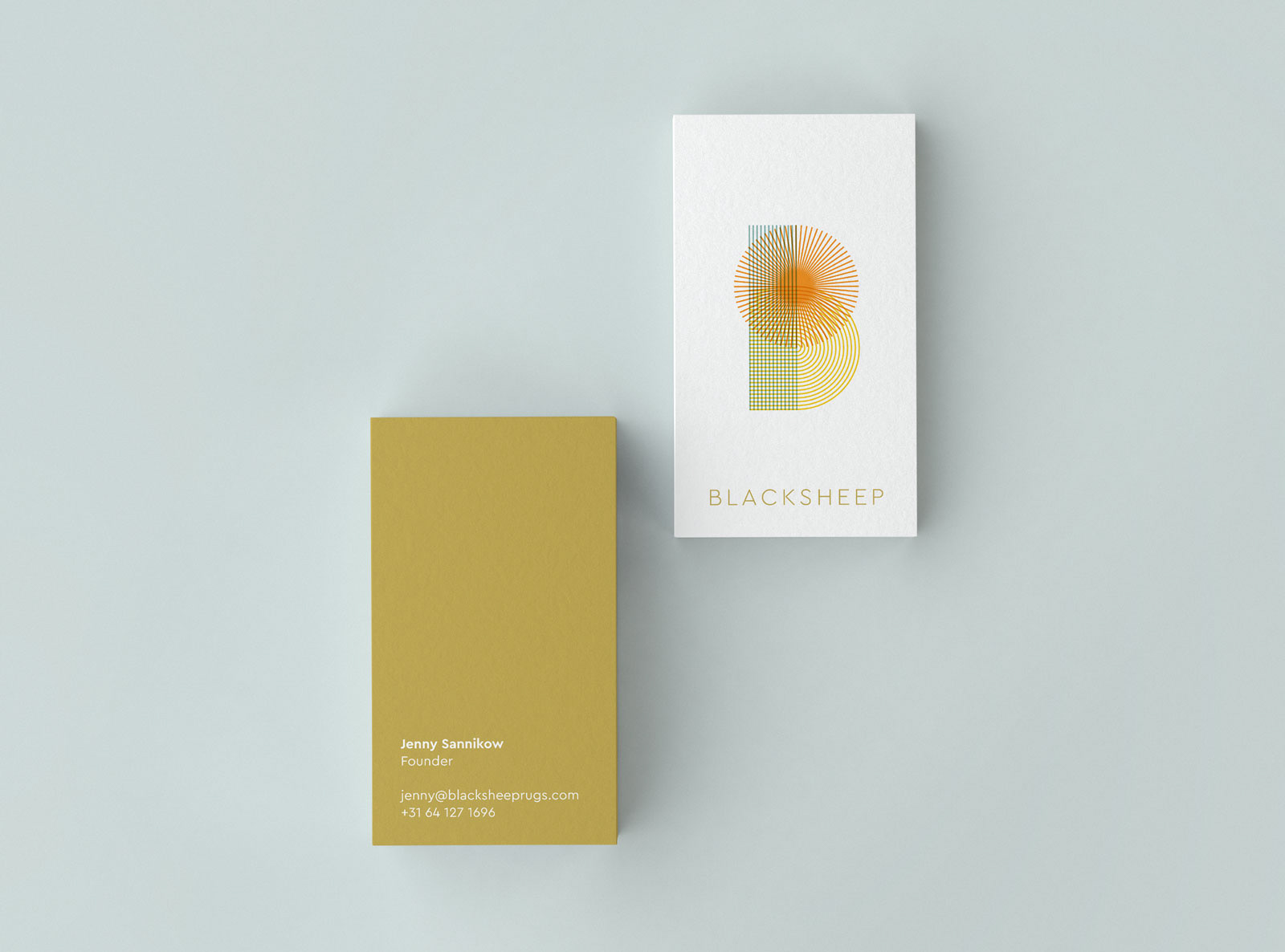
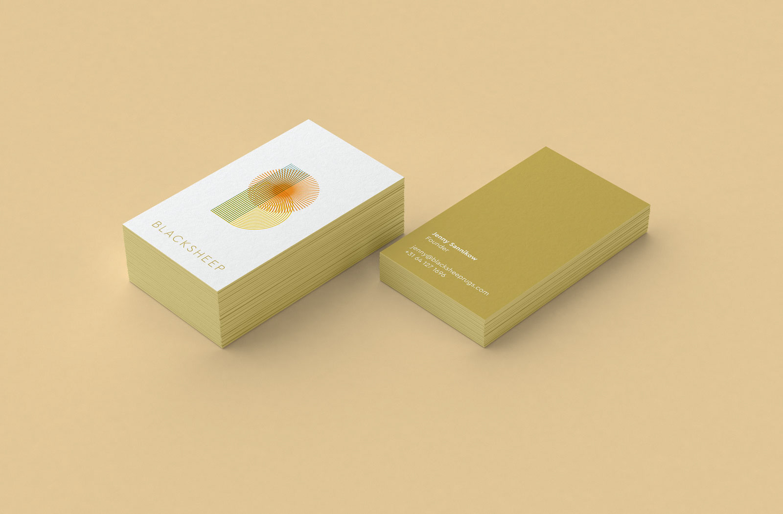
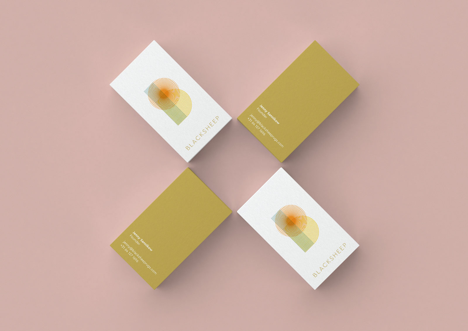
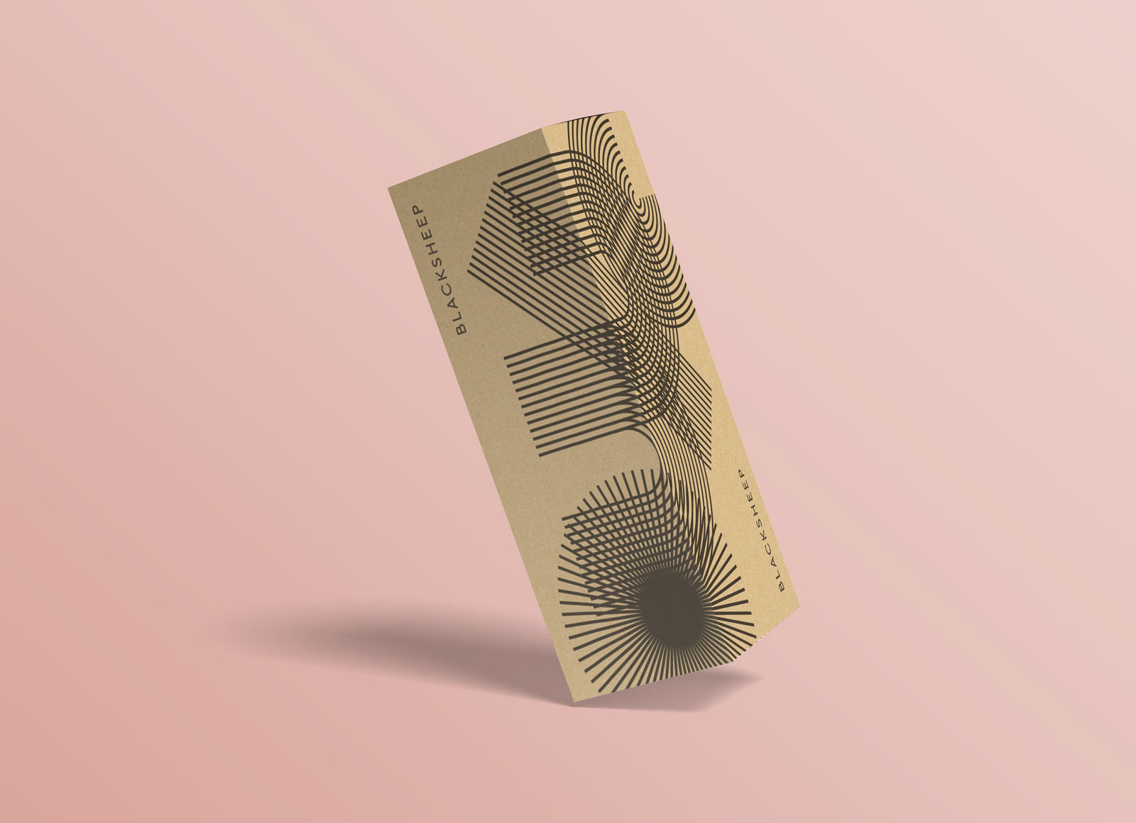
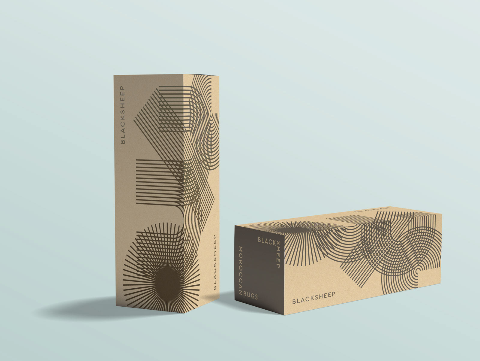
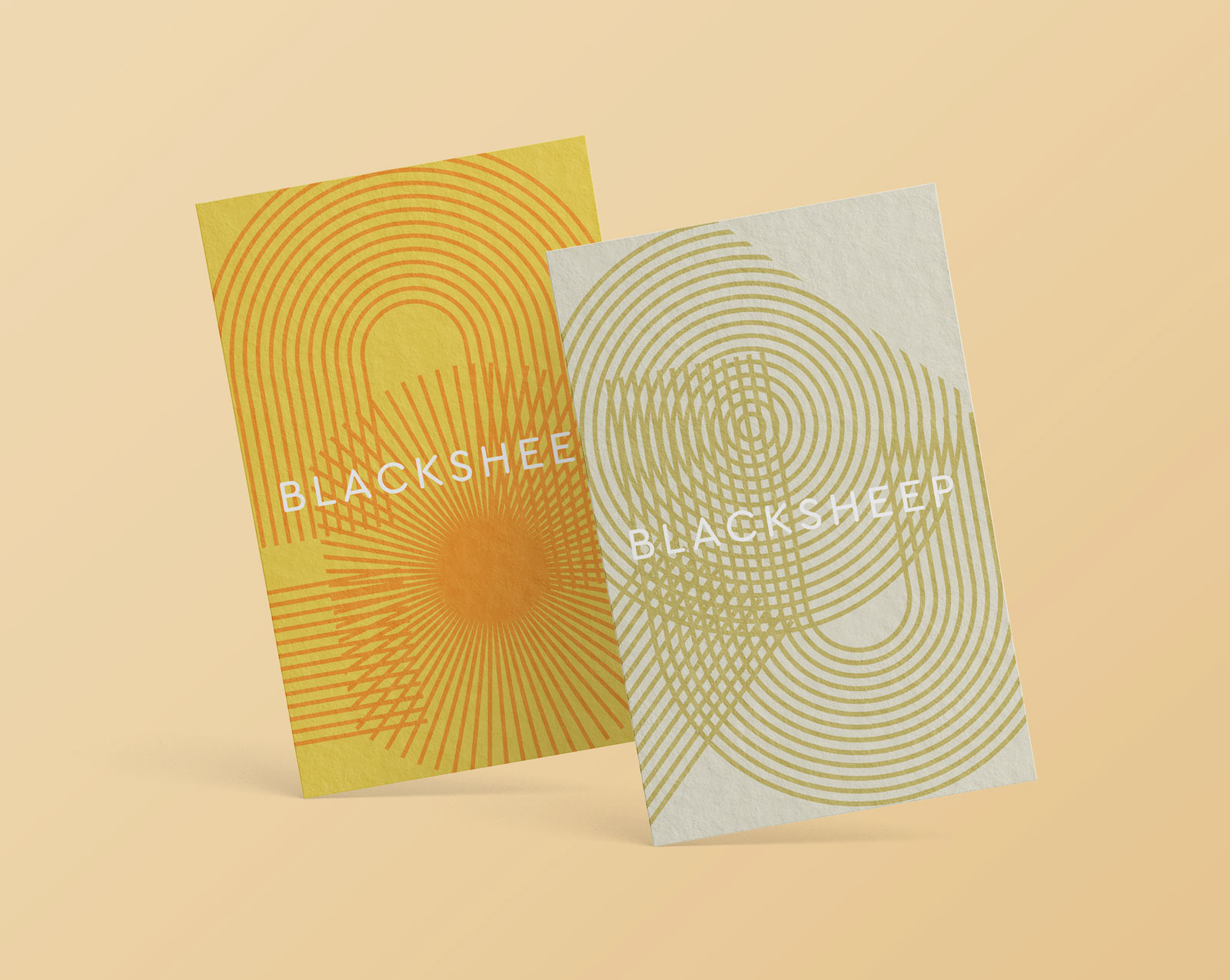
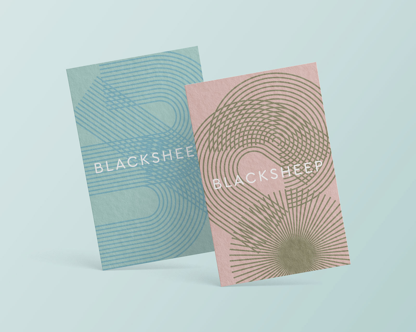
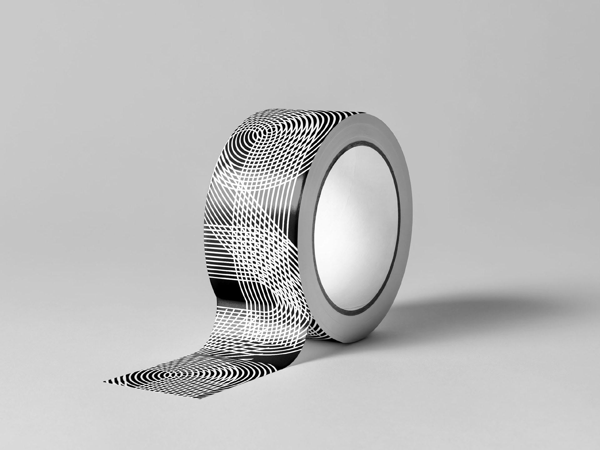
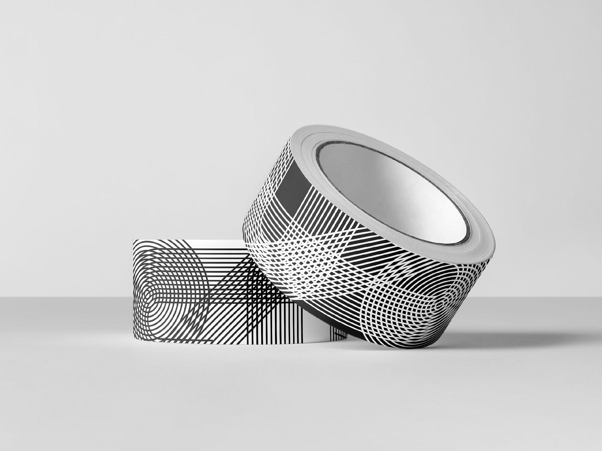
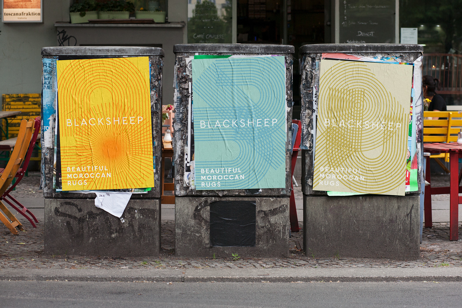
For young rug company BlackSheep, Tenzing created the complete branding. The concept of woven rugs is given an interpretation by the lines in the graphics that are abstract representations of threads. When overlapping, they create beautiful moiré effects. This interweaving effect is explored throughout the different media — from signs, cards and labels, all the way to the videos for social media.
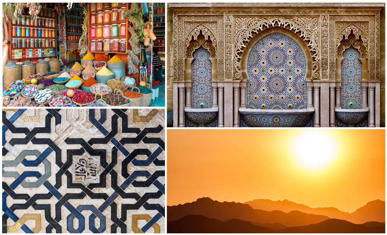
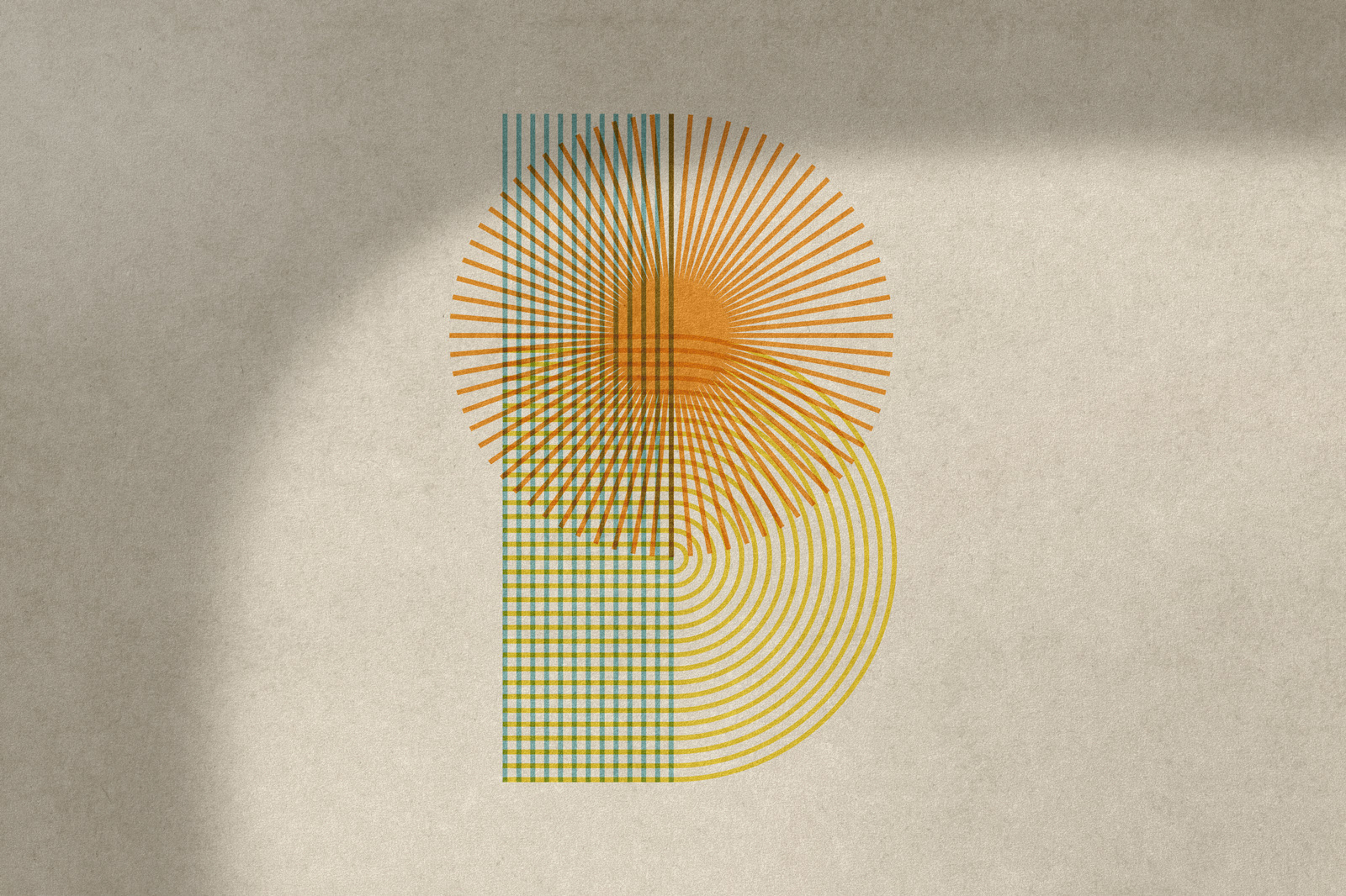
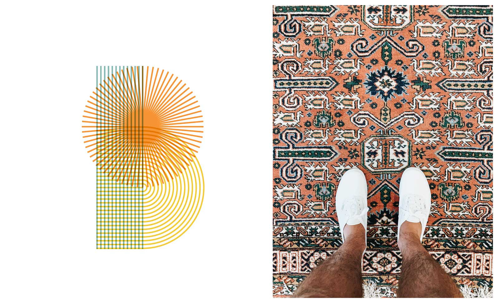
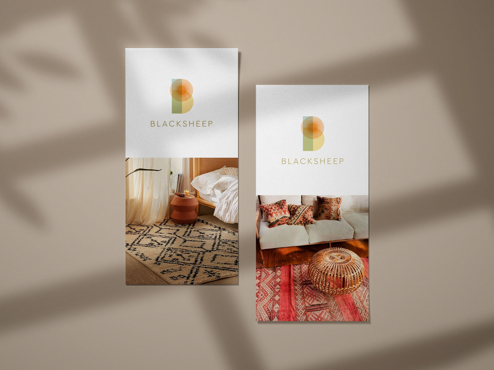
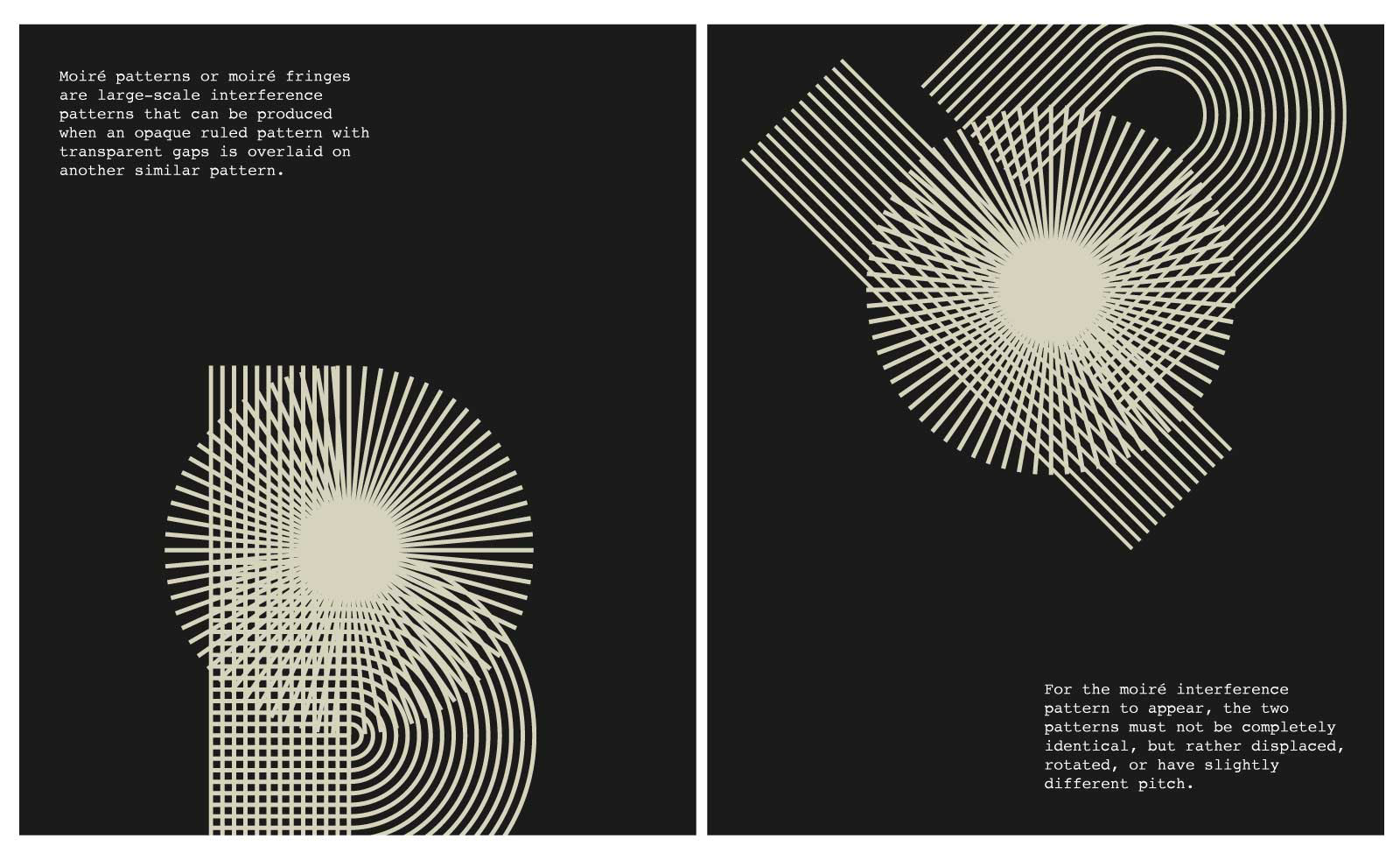
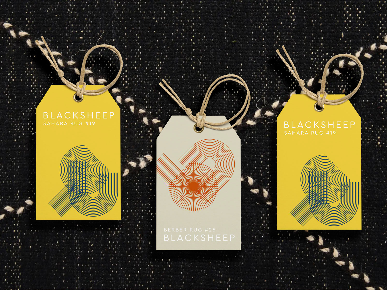
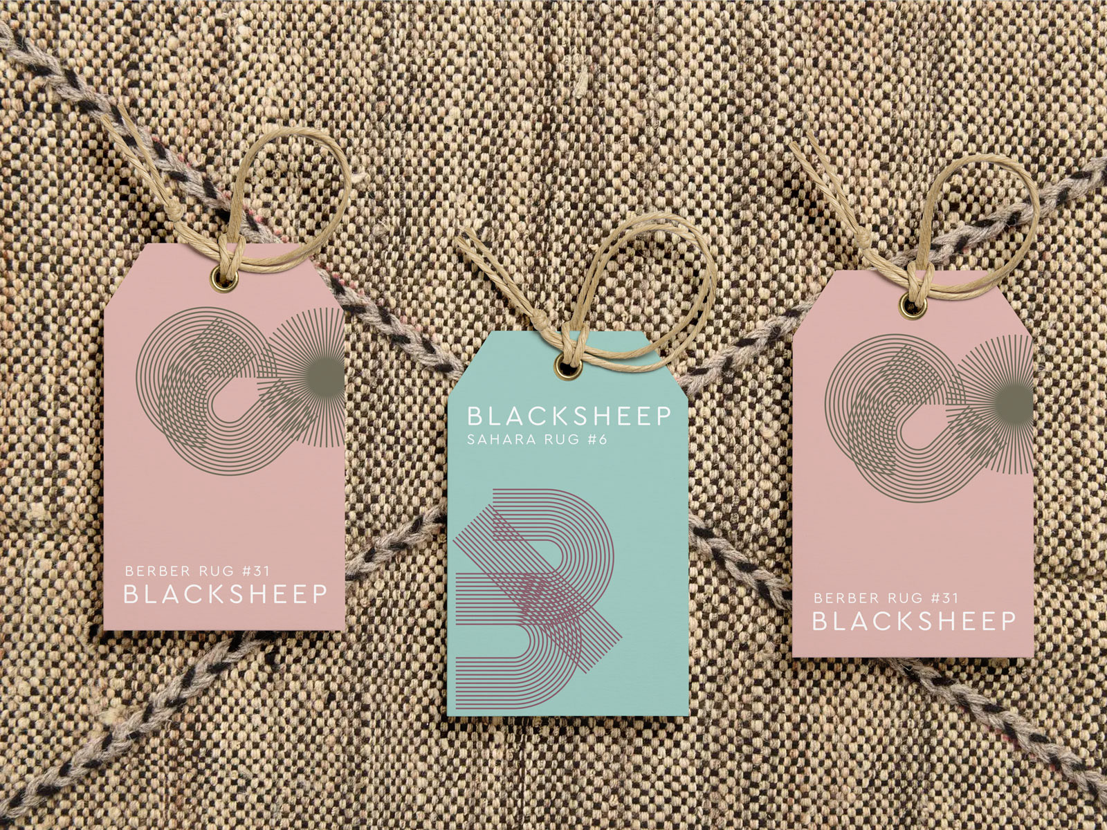
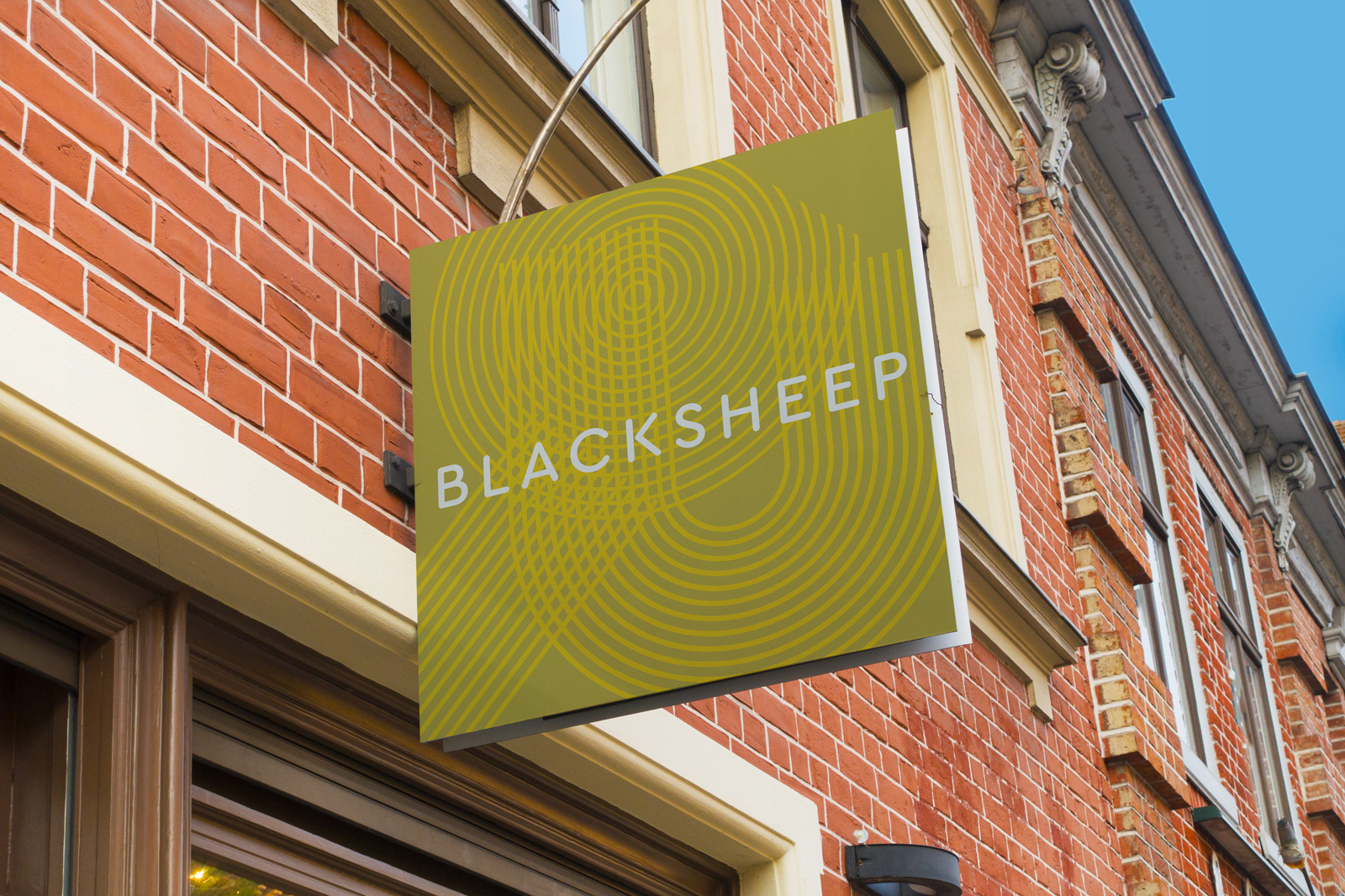
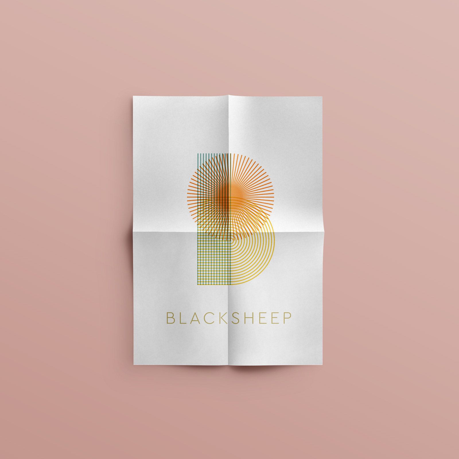
Inspired by the colours and textures of Morocco, the logo represents the abstract initial B with an intricate weave of colourful lines and a sunny disposition.
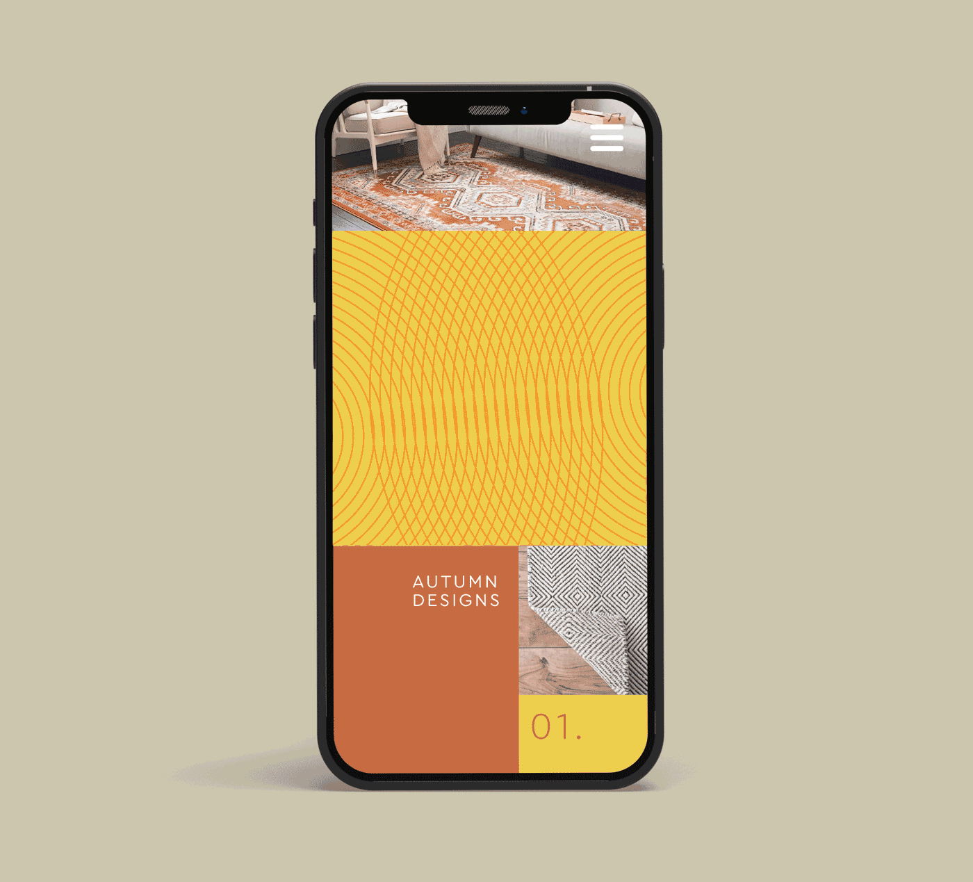
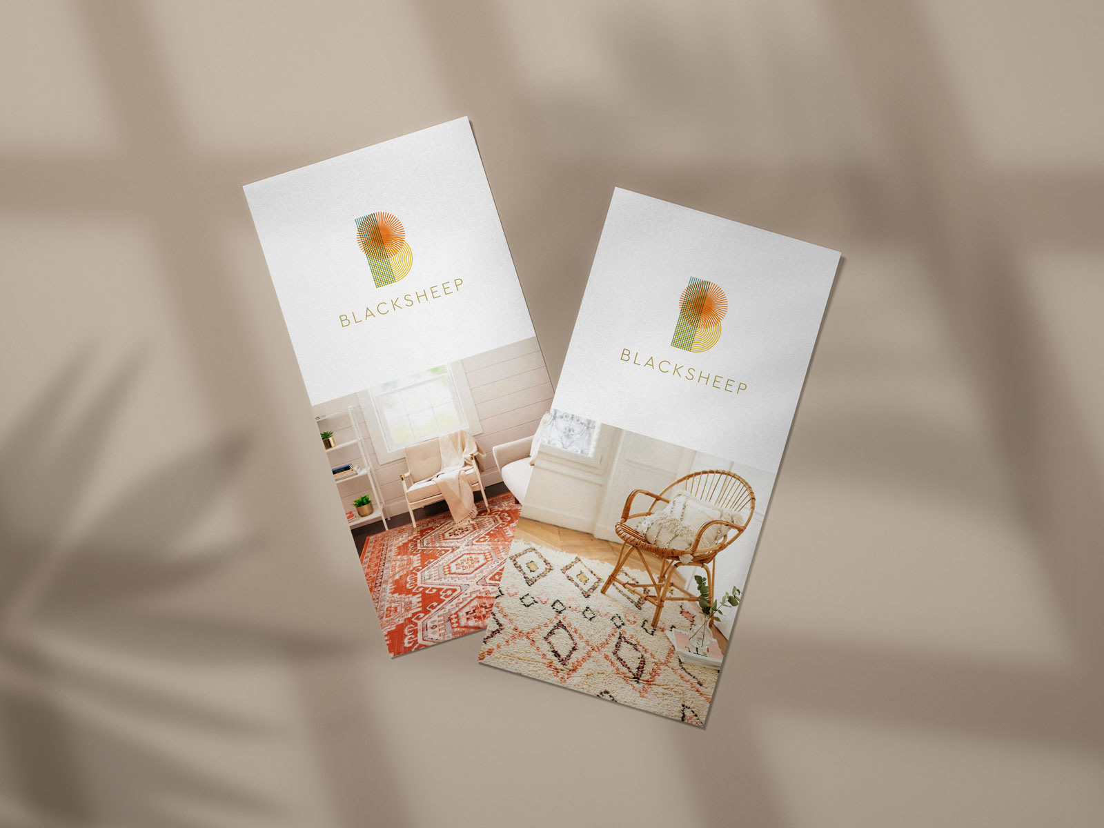
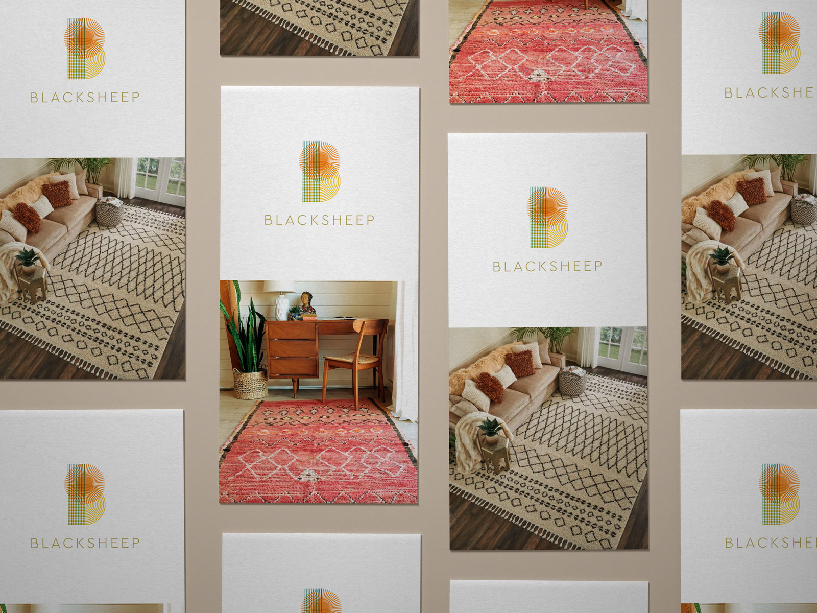
Promotional flyers show details of interiors where the rugs of Blacksheep are displayed.
The overlapping lines that reference the weave of textiles can be combined to create moiré patterns. These iridescent patterns are normally unwanted artefacts but for Blacksheep we embrace this layered effect and we try to exploit it on purpose.
The product tags are attached to the rugs with a simple hemp string and contain information about your specific rug type and design. As these are all individual pieces, each rug gets its own number.
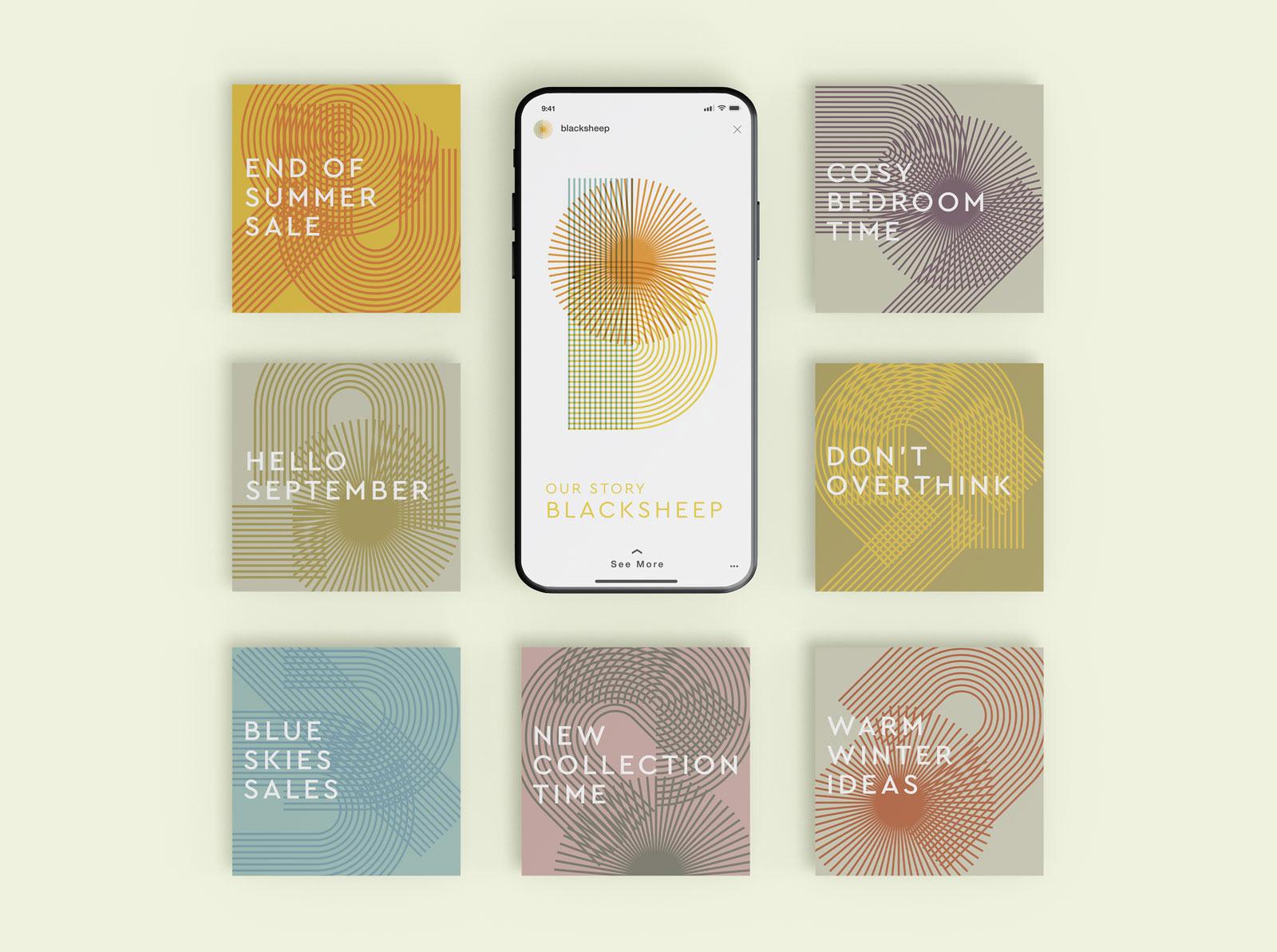
The moiré can be put to maximum use in simple animations. Where the lines of the logo overlap we can find visually interesting effects happening.