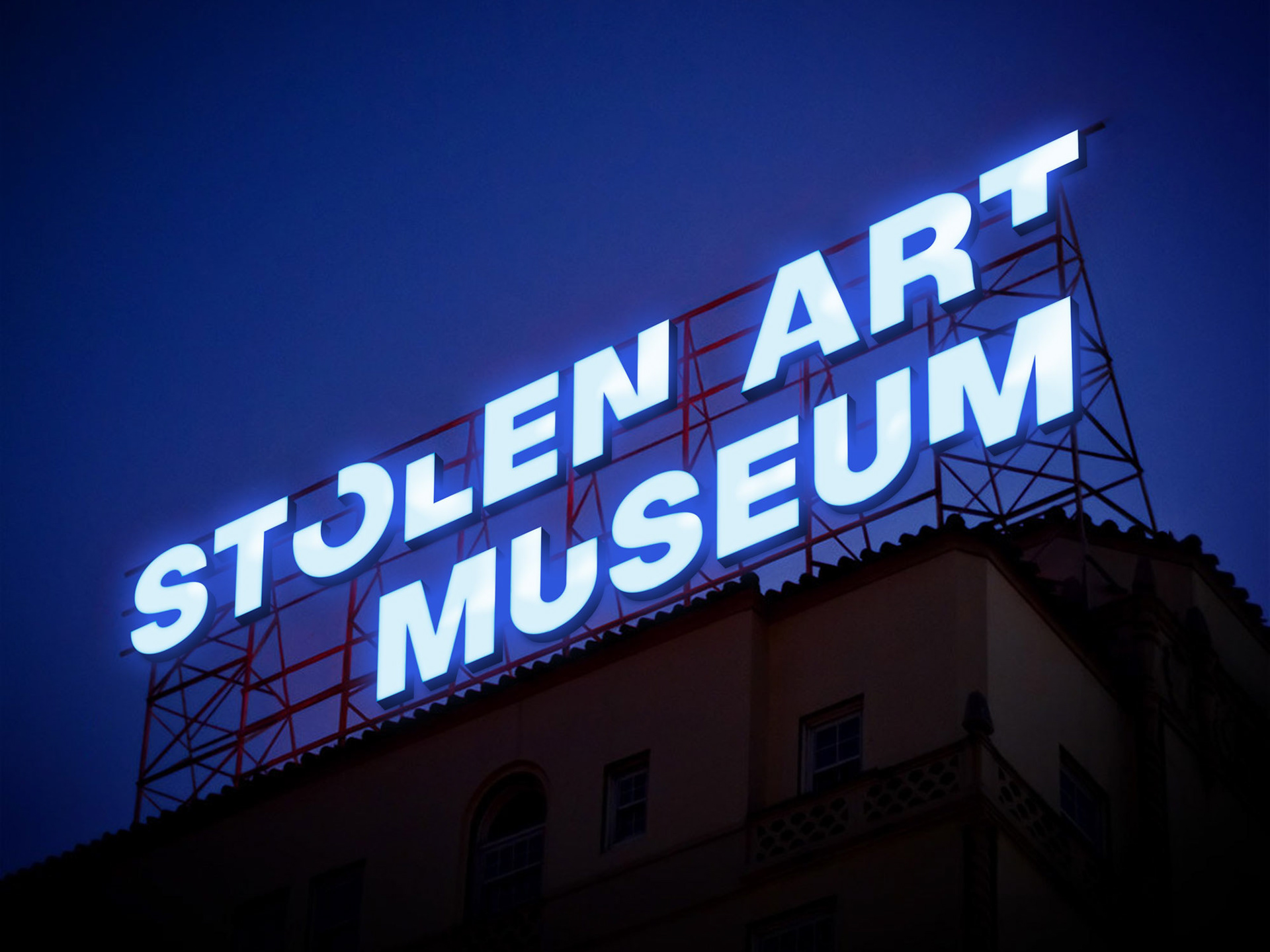
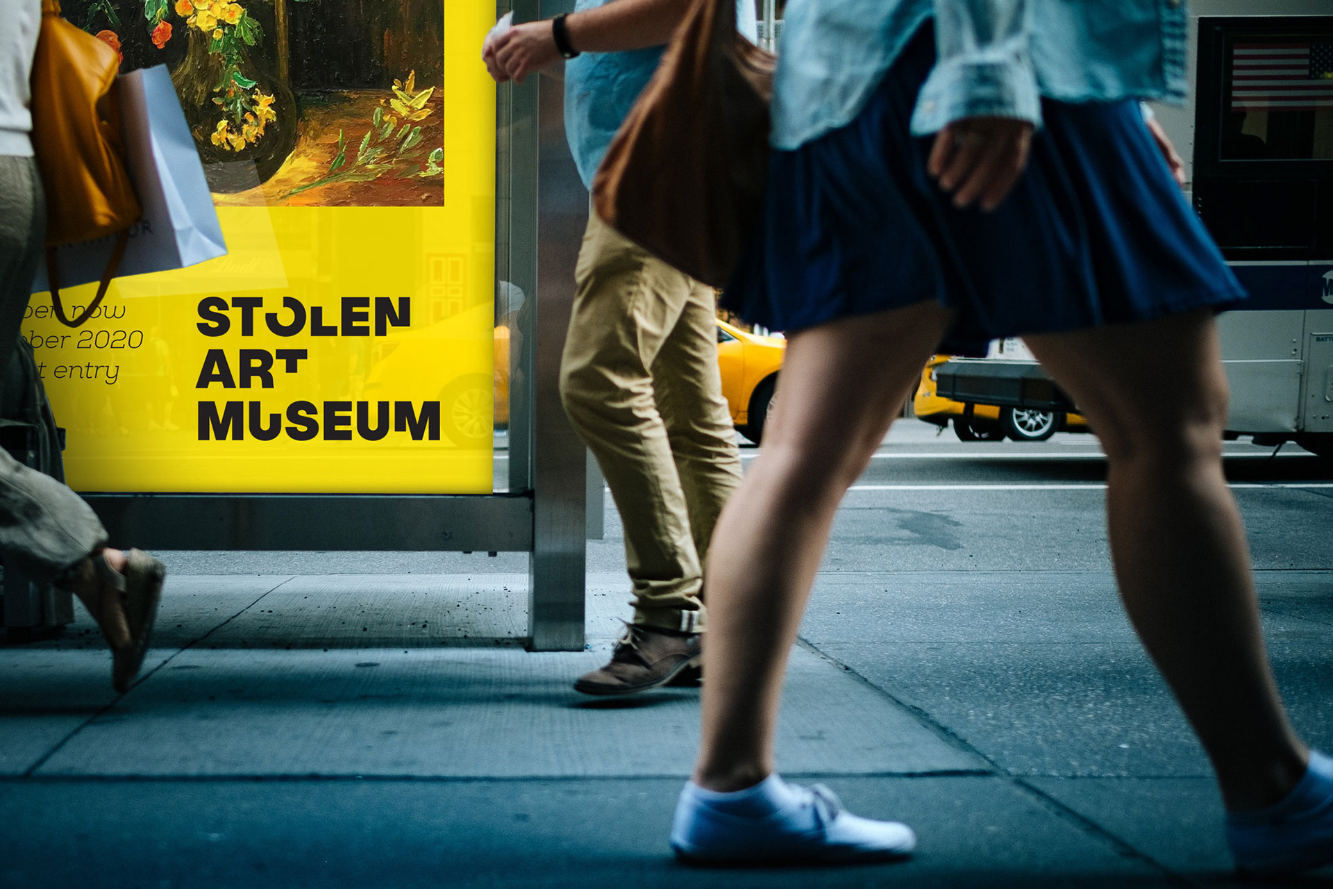
Many famous pieces of art are not available to the public anymore. Some time in the past they have been stolen from private collections and even museums. The Stolen Art Museum will display perfect replicas of these pieces of art that proved so seductive that people would steal for it. Tenzing was asked to design the logo and collateral that would be instantly recognisable and easy to roll out across different media.
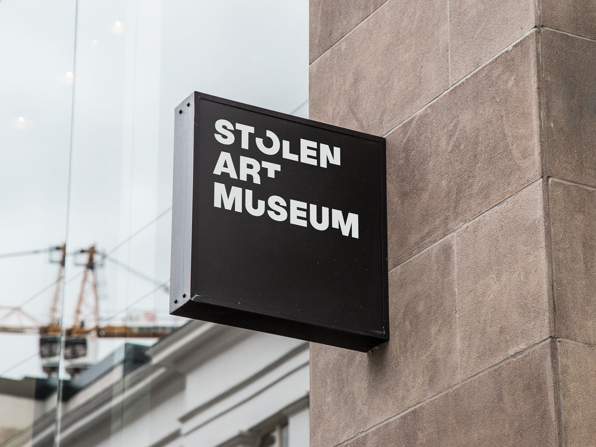
The logo brings the notion of "stolen" back to its fundamentals and into the logo. The missing pieces of typography reference stolen pieces that are gone forever and communicate the nefarious act immediately. Simple and pared-down.
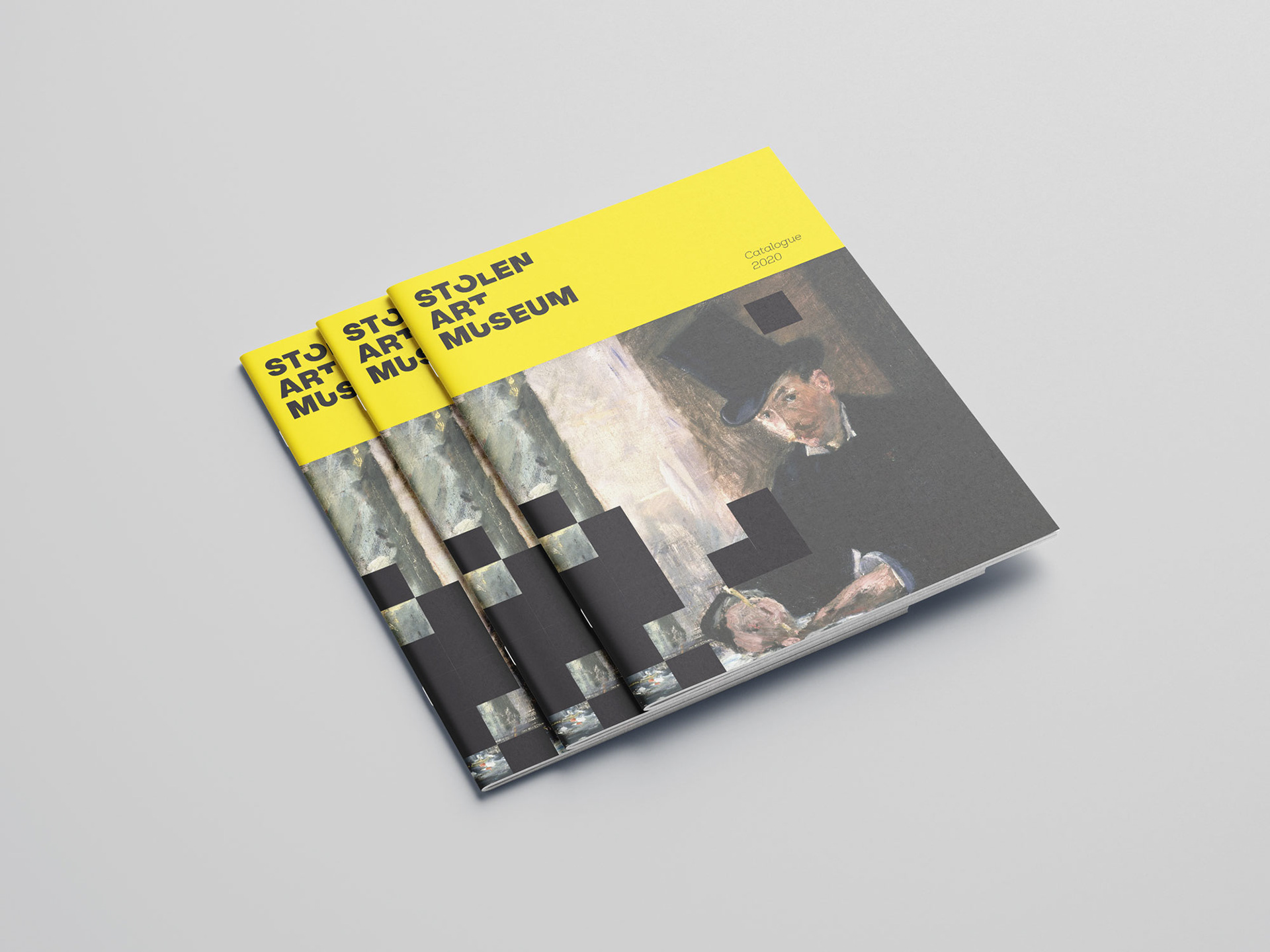
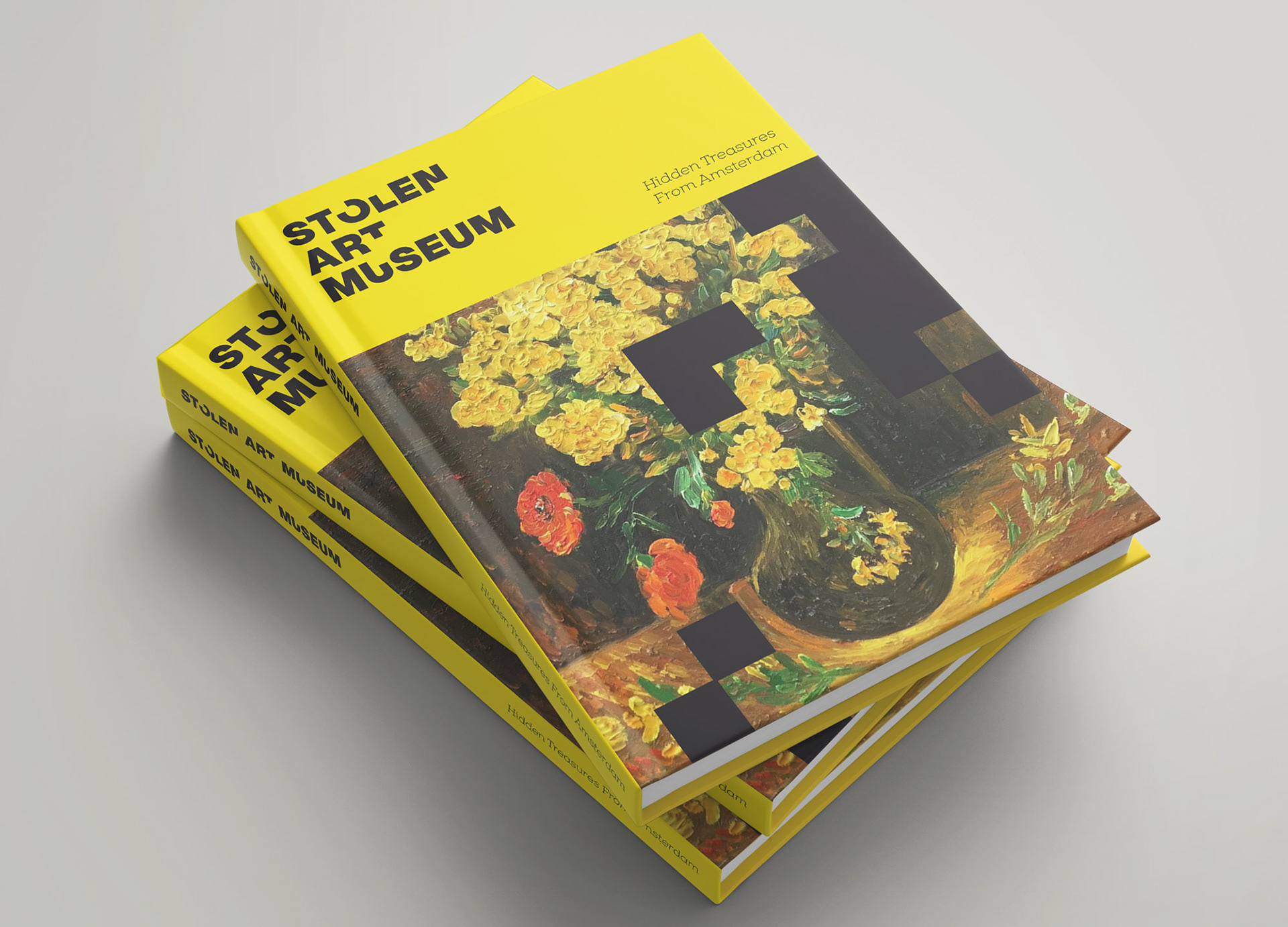
For the covers of catalogues, brochures and event booklets we even "steal" parts of the art works by cutting black blocks out of the visuals, similar to what we do in the logo, evoking a feeling of the art disappearing before our eyes.
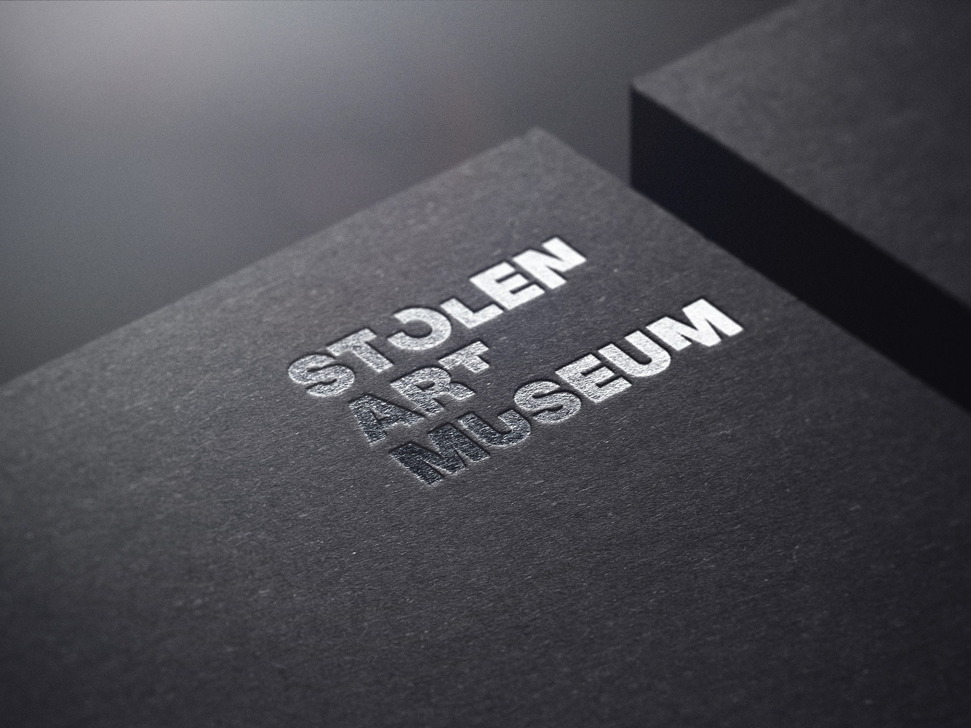
The business cards are nearly blind embossed, with only a transparent varnish applied. This enhances the feeling of obscurity and secrecy that cloaks the world of stolen art.
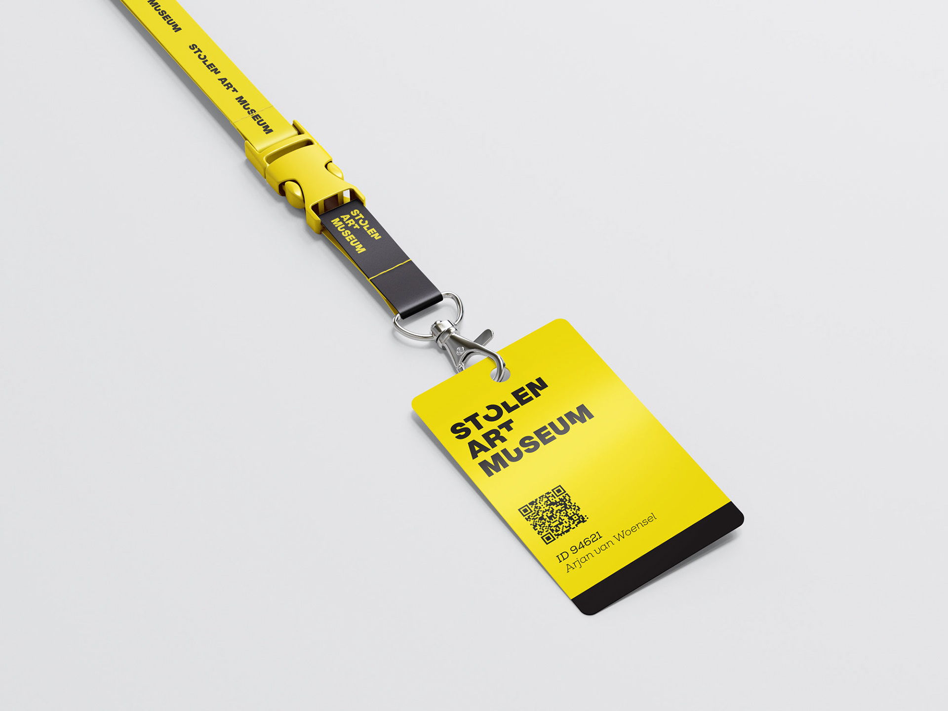
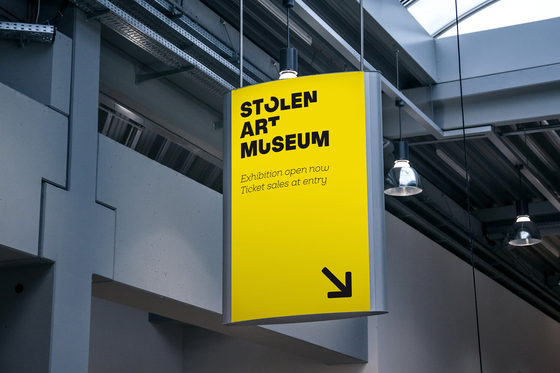
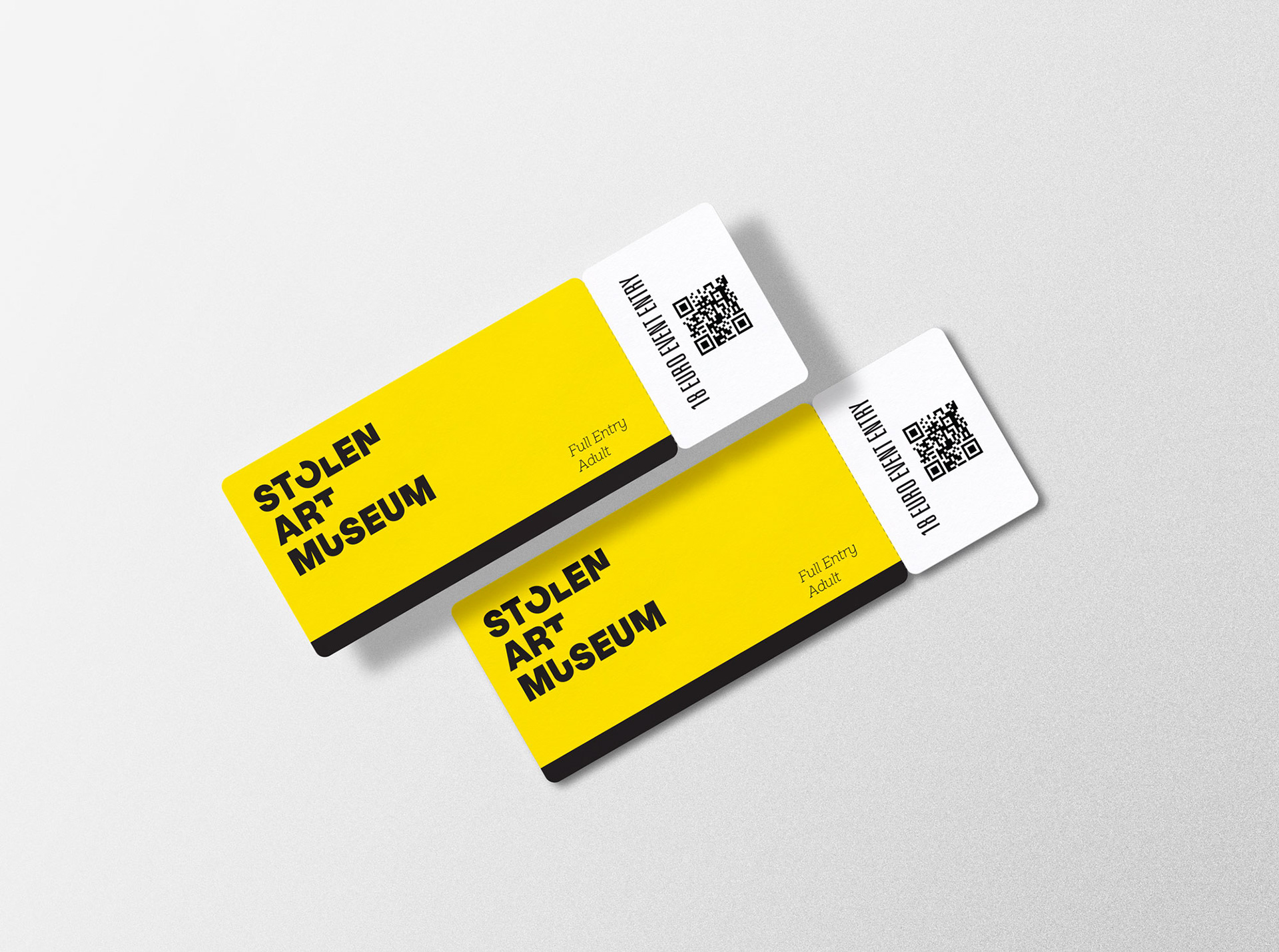
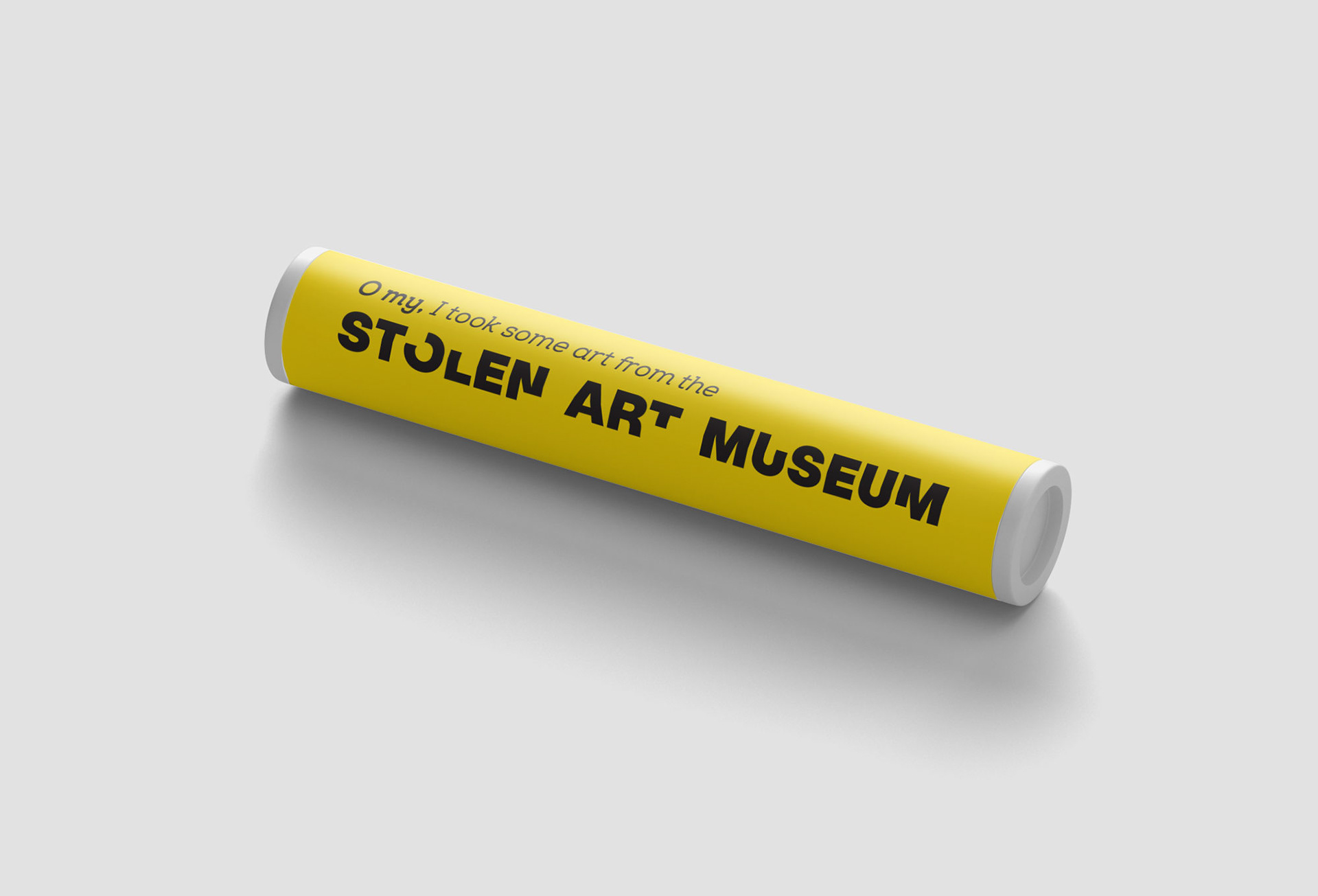
The black and signal-yellow colour scheme references police lines that are installed at a crime scene to keep nosy people out.
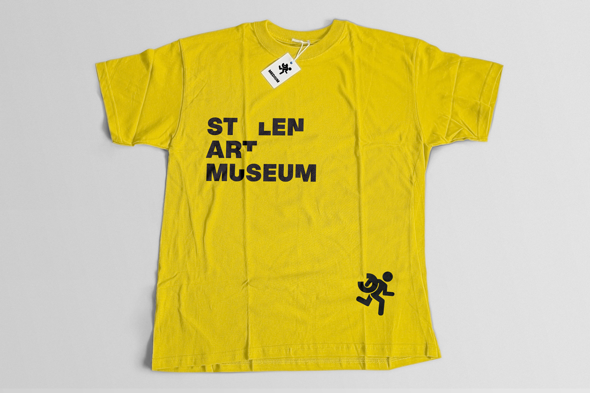
We thought we could have some fun with the T-shirts and have a little robber take off with the letter O of the logo.